In this tutorial I’m going to show you how to create a very simple fade-in effect on the background image of an Elementor container or section. This method will enable you to keep the opacity on any containers within the parent container. The desired effect will look something like the image below.
Hover over this box to see the background fade-in
This text, or any other content within the container will not fade when the background fades. It will not be affected in any way.
How it's done with Containers in 2024
I’ll first show you how to do this with containers (which is now the default in 2024), but I’ll also show you how to achieve this using sections, which many sites built before the latest upgrade will have.
Step 1 is to create a new Container and add a background image to the container. Go to Style -> Background Overlay and add your image. Do not just add a background image to the container, make sure you are adding the image using ‘Background overlay’, or this will not work.
Next, click on ‘Advanced’ and add a class to this container. Go to Advanced -> CSS Classes and insert a class name. It can be anything, but for the purposes of this tutorial I’ll call it ‘my-fade-container‘ (see the image below)
When you use the ‘background overlay’ in Elementor, it adds the image using the CSS pseudo-class ‘::before‘. This is what we’re going to manipulate when the user hovers over the container.
					.my-fade-container::before{
    opacity:0;
    transition:opacity 0.7s;
}
In the code above we are targeting the ::before element that Elementor adds when a background overlay is added to a container. We are making the opacity 0 so that it is initially hidden. We are adding a transition length of 0.7 seconds, so that the fade in is not instant (you can change this to any duration you like).
					.my-fade-container:hover::before{
    opacity:0.5;
}
The next piece of CSS code we add is shown above. This will show the background when the user hovers over our container by changing the opacity to something above 0 (in this case, I’ve chosen 0.5 – so half transparent).
You may notice that you still have some spacing between the inner content of your container and the background image. This is because Elementor adds another element with a class ‘e-conn-inner’. In the next piece of code we’ll target that element, making the padding and margin 0.
					.my-fade-container .e-con-inner{
    padding:0;
    margin:0;
}
And that’s pretty much it! To fade-out an image instead of fade-in, simply start with an opacity above 0, and change it to 0 on the hover.
In the example above I’ve also added a border, and some padding to the container as well as the rule ‘cursor:pointer’ for hovering over the container, but essentially you only need the above CSS rules to make the effect work.
How it's done with Sections
If you made your site before the latest Elementor update, your site may use Sections instead of Containers, so the above code will not work. But fear not, the code for sections is just as easy.
Step 1 is to create a new Section and add a background image to the section. Go to Style -> Background Overlay and add your image. Do not just add a background image to the section, make sure you are adding the image using ‘Background overlay’, or this will not work.
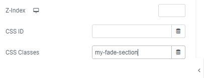
Next, click on ‘Advanced’ and add a class to this section. Go to Advanced -> CSS Classes and insert a class name. It can be anything, but for the purposes of this tutorial I’ll call it ‘my-fade-section‘ (see the image below)
When you use the ‘background overlay‘ for sections Elementor, it adds a new div with the class ‘elementor-background-overlay‘ into the section, and then any containers you have within the section are added as separate divs on the same level as the background-overlay div (i.e. not children, but siblings). This is what we’re going to manipulate when the user hovers over the container.
					section.my-fade-section .elementor-background-overlay{
    opacity:0 !important;
    transition:opacity 0.7s;
}
In the code above we are targeting the .my-fade-section element that Elementor adds when a background overlay is added to a section. We are making the opacity 0 so that it is initially hidden. We are adding a transition length of 0.7 seconds, so that the fade in is not instant (you can change this to any duration you like).
					section.my-fade-section:hover .elementor-background-overlay{
	opacity:0.5 !important;
}
The next piece of CSS code we add is shown above. This will show the background when the user hovers over our section by changing the opacity of the overlay div to something above 0 (the highest opacity setting is 1). In this case I’m changing it to 0.5, or ‘half’ transparent.
And that’s pretty much it! To fade-out an image instead of fade-in, simply start with an opacity above 0, and change it to 0 on hover.
In the example above I added a border to make it more visible, and some padding to the container as well as the rule ‘cursor:pointer’ for hovering over the container, but essentially you only need the above CSS rules to make the effect work.
Let me know if this worked for you in the comments below.

